This reminded me of how quaint I found much of the signage in the UK when I first visited, because a lot of the street signs are less than a metre off the ground, and are positioned 'behind' the pavement on fences, etc. Again, great for pedestrians, but can be annoying for newcomers trying to navigate around! Luckily, however, it's almost impossible to drive quickly through London city back streets (for e.g.) because they were not built for cars! Here are some (naughtily hotlinked) examples:


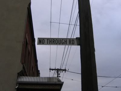
In Melbourne (and Victoria generally), street signs are much higher off the ground, and most often right on the corner of the street (on telephone (telephone?) electricity poles or on their own poles). They're also quite a bit smaller. It's interesting to see the difference in perspective of all the photos when googling for images of London street signs and Melbourne street signs! Again, apologies for hotlinking.


Anyway, I just thought it was interesting. Mainly because I am kind of fascinated by signs, and street signs are so ubiquitous and so location-specific, yet most people hardly think about how they change the landscape visually, and how they construct the environment spatially.
No comments:
Post a Comment